
Properties define the characteristics of a component that affect its visual appearance or functionality, and can be customised or overwritten in both design and code. These properties form the parameters that designers and engineers use to tailor components to specific needs, maintaining flexibility while ensuring consistency.
In design tools like Figma, components come with properties such as variants, booleans, text content, and instance swaps, which allow designers to adjust a component’s behaviour and look. For example, a button can have different sizes through variants, while booleans let designers toggle features like icon visibility without needing separate components.
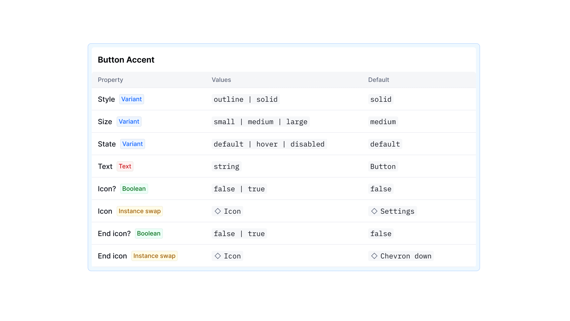
During implementation, a component’s API defines how its properties are exposed and translated into functional options for engineers. It provides a clear mapping of the design properties to the underlying code, specifying which properties are required, which are optional, and how they should behave in different contexts.