
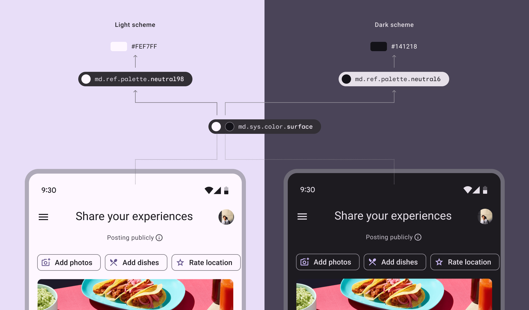
Themes in design systems allow for the customisation of the visual aspects of components and UI elements while preserving the underlying structure and functionality. A well-known example of themes are dark and light modes, which adjust the visual presentation of the interface, such as background colours, text, and icons, while the overall layout and interactive elements remain largely unchanged.
In design systems, themes are heavily dependent on design tokens—abstracted values like colours, typography, spacing, and other UI properties—that define the appearance of the system. By changing these tokens, a theme can be easily modified or switched, ensuring flexibility without disrupting the core functionality.
Themes are often an integral part of multi-brand design systems, where a single system can be adapted to meet the distinct branding and visual identity requirements of different products or companies. This connection allows for a cohesive yet customisable design approach that can scale across various products and brands.