A component is one of the core building blocks of a design system, as it represents reusable interface elements that designers and engineers can use to ship products. This means that components exist not only in design software but also have a coded counterpart.
Components are built using tokens from the design system to define colours, spacing, and other aspects that contribute to their visual representation.
Classic examples of components include buttons, inputs, list items, cards, and other elements that are frequently used across different products.
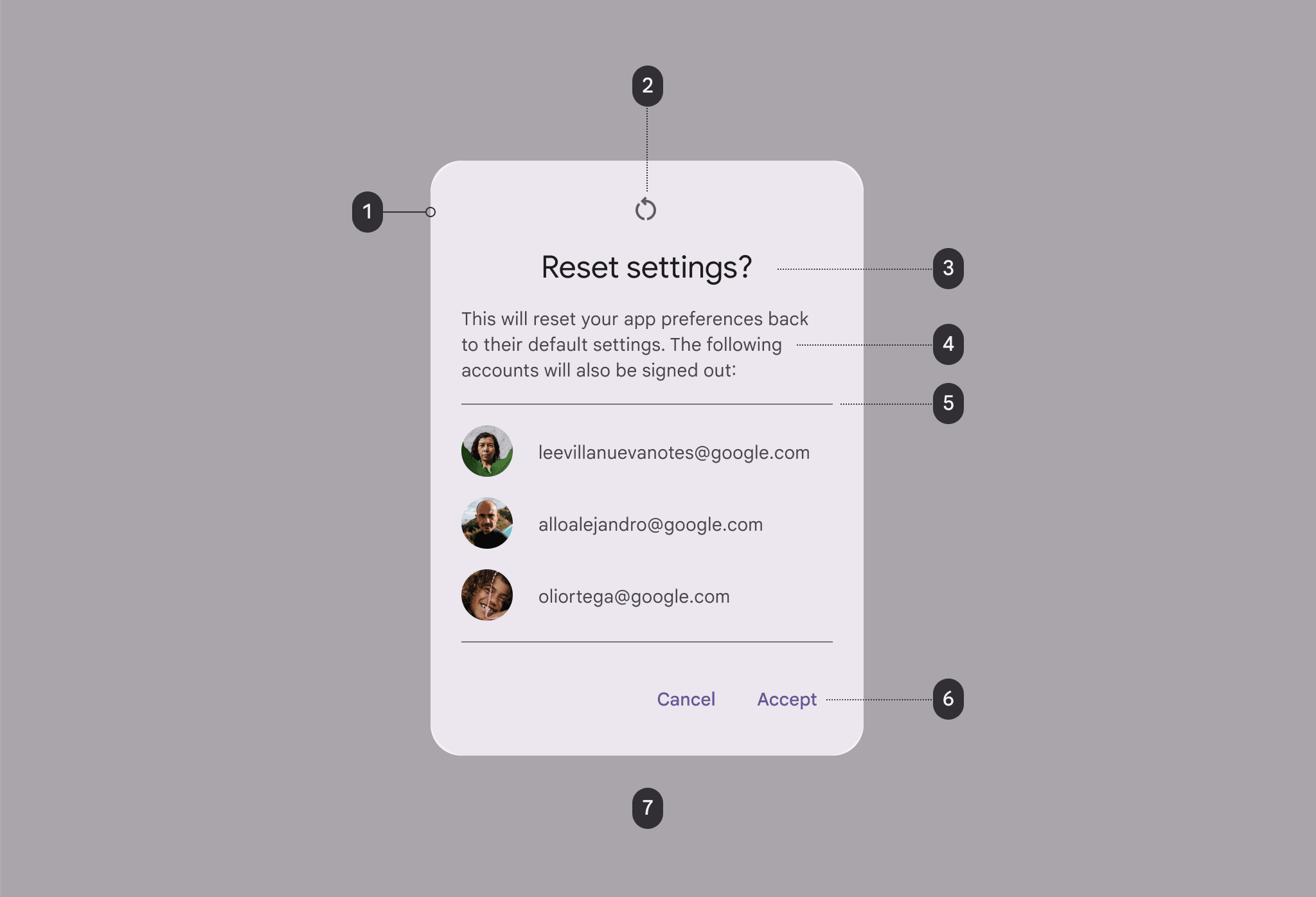
Often a dedicated design system team creates and maintains these components, making them available to product teams. Another important characteristic of components is their properties, which determine the possible outcomes they may allow. This is why it’s essential for components to offer a certain degree of flexibility and customisation to meet the varied needs of designers and engineers.
The alternative to design system components is custom components, which are built by product teams when they cannot find suitable alternatives in the design system. These custom components can, in turn, be contributed back to the system so that other teams can benefit from them.